Scatter Plot view
When you create a scatter plot with the Statistical Analysis tool
To add additional properties in the scatter plot, select them from the Horizontal axis and Vertical axis lists in the right-hand control panel. The correlation coefficient is calculated and displayed in the control area.
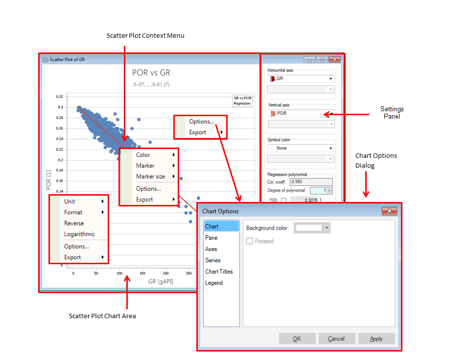
Each Scatter plot view has a number of different areas and controls (see picture below):
- The chart area is where the scatter plot is displayed.
- In the control area are additional controls to calculate the scatter plot.
- The context menus, shown by right-clicking in the chart area, offer various plot customization options.
- The Chart Options dialog can be opened from the context menu and provides various chart customization controls. It is available on every chart, see Chart Options.
The Scatter Plot view click to enlarge
Using the Settings Panel
The Settings Panel provides the following options to change the properties of the scatter plot:
Horizontal axis Select a property to be displayed in the scatter plot on the Horizontal axis. If you change the property selection here, it will overrule the initial property selection made in Model Statistics panel Step 3. However, all applied filtering options will remain.
Time point or realization (1) In case you select a time property with several time steps or realizations for the Horizontal axis, an additional selection list is made visible where you can select a specific property time step or realization you want to analyze.
Vertical axis Select a property to be displayed in the scatter plot displayed on the Vertical axis. If you change the property selection here, it will overrule the initial property selection made in Model Statistics panel. However, all applied filtering options will remain.
Time point (2) In case you select a time property with several time steps or realizations for the Vertical horizontal axis (e.g., a property containing a data for multiple time steps or multiple realizations), an additional selection list is made visible where you can select a specific realization you want to analyze.
Symbol color Option to choose the color of the scatter plot based on a list of available properties.
click to enlarge
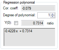
Regression polynomial If you change the degree of polynomial the regression curve will be recalculated. The corresponding expression will be shown below. This option is only available when a regression curve is made visible with the help of the toolbar button.
Cor. coeff. This displays the calculated Correlation coefficient of the current selected property data, which is a measure of the correlation between the two properties displayed in the scatter plot.
Y(0) This allows you to specify a custom Y-axis intersection point for the regression line.
Filter classes In case you set a filter and check the option 'Separate output for each selected item' in the Set filter step on the Statistical Analysis form, an additional selection list is made visible where you can select the filter classes for which the scatter plot must be shown.
Using the Scatter Plot context menus
The context menu for the scatter plot can be opened by a right click on an object in the scatter plot view. It provides the following options to specify the scatter plot:
Marker Use this to set or change the marker style of the data points.
Marker size Set or change the size of the data point symbol.
Options Modify the settings of the histogram. The Options Dialog opens at the relevant element, depending on the position clicked. See Chart options.
Export Use this option to export the data to clipboard so that it may be pasted into other applications.
Unit Click on an axis to view the Unit menu, from which you can select the display unit (cm, ft, in, m, etc.).
Format Select the display format of the selected axis. With the Auto setting, a format that fits the data set is automatically selected.
Reverse This reverses the axis of the scatter plot.
Logarithmic This displays the graph in a logarithmic scale.
Using the Scatter Plot toolbar
The scatter plot toolbar contains buttons used to show or hide different parts of the histogram, control the zoom level, and capture the view for use in other applications.
|
|
Show/hide settings panel Display or hide the Settings panel. With the Settings panel hidden, the chart area fills the whole of the plot view. |
|
|
Show/hide legend Mode to show or hide the legend of the chart. |
|
|
Show/hide regression line Show or hide the regression line. |

|
Copy view to clipboard Copy the view to the clipboard so that you can paste it into another application. |

|
Save view to file Save the view as an image file such as a *.jpg, *.png, or *.tiff. |

|
Zoom in Zoom in on the view. |

|
Zoom out Zoom out of the view. |
|
|
Reset zoom Reset any zoom changes back to the original view. |

|
Probe When selected you can hover over any part of the chart to view additional details such as the value of a specific point in the scatter plot or regression line values. |